Friday, 11 May 2012

Evaluation: Question 1


Our media products follow typical conventions of existing newspapers and websites on the Internet.

To start we noticed that most logos have the title of the newspaper in bold large text with the smaller details above it or below it in either a sans-serif font or just a smaller block font. A lot of logos also have a block of colour behind them to make the title of the newspaper stand out more from the rest of the page.


Above are typical newspaper logos that we tried to follow as they have a recognised technique in drawing in the audience to buy the magazine. Below is ours which follows the conventions of existing newspapers.


Our final logo that will be used for the newspaper and the website looks very similar to the two above, The Sun and Wigan evening post, but with our own ideas added. We liked this layout and colour scheme the best as it relates to the town Wigan as red is associated with the place. It also exaggerates Wigan to make the newspaper and website stand out more to the public. Overall our logo uses typical conventions of a newspaper logo.

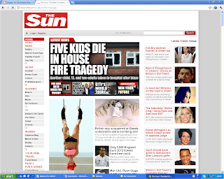
We modelled our website and newspaper of existing medias that are already popular to the public and attract their attention easily. We followed all of the conventions such as the logo in the top left corner, advertisement and stories strategically placed for the best view. For our website we based it off the Sun website as we thought it had the best layout (below)


Our adverts on the newspaper and the website also follow typical conventions. We researched thoroughly what makes a good advert and created a few of our own. We noticed that both in the newspaper and website in real medias that they where all colourful and attractive to draw the readers attention. However, not so big so that it doesn't take much of the readers attention from the stories. 

For example below the advert is uses a bight colour scheme but isn't to big that distracts the reader.


We took the ideas of the above advert and created out own that will also do the same job as other adverts.


The same goes for our website, we researched a lot about existing websites and their adverts since they play a major role for the website. This is because adverts are the way the generate money to fund the website and keep it running. Below is typical website advert that we found on the sun.


Wednesday, 29 February 2012

Products

Newspaper


Poster


Website

http://www.thewiganword.tk/

Evaluation: Question 4

How did you use new media technologies in the construction and research, planning and evaluation stages?

We used a wide range of new media technologies in the construction and research, planning and evaluation stages. This is because we aimed to create a professional set of new media texts and by using technologies that anybody can access we believe we achieved this.


When making our newspaper, newspaper adverts and poster we used Adobe Photoshop CS5. It was useful in editing images, and in constructing adverts, adjusting the layout through using the different layers. The effects offered in the software helped us created products with high standards that could be seen as professional and specialized.

One of the many effects used was a lens flare on the logo on the poster. This adds depth to the poster so it’s not just a flat picture.


When making the website and adverts for the website we used Adobe Fireworks and Dreamweaver. We used fireworks to get the layout of the website sorted and the position of all the photos and adverts within the document. We then used Dreamweaver to enter the main text from the article and by using a drop shadow, added depth and a different colour background.

Both of the above software had useful features that we used to optimize and enhance our product. A big feature was the ‘Preview in Browser’ option. Using this alongside trial and error enabled us to modify and adapt our website to become professional and have a high quality finish.


We also used very basic software such as publisher to draw designs for our newspaper and website. Publisher also allowed us to create brainstorms and graphs easily to display thoughts and results that were gathered during the research stage.


We also used an online website that you can generate surveys and ask tehe public for their opinion. We used survey money to ask the public what type of articles they would like to see in a local newspaper/website and what type of adverts attract their attention the most. This was very valuable as it gave us the public’s opinion and what they want out of a newspaper and a website.


After completing our products we uploaded pictures and a link to facebook and used it as an outlet to display our real media texts. From this we learned the opinions and thoughts about our products and how we could improve and modify them.


We used Microsoft PowerPoint to create an easy format to display data we had gathered. We then uploaded these slides to a site called slide share. The process is really simple and ages a different angle to the way we outputted the information on our blog.


Blogger has been a key part of our project as we used it to post about our progress and how events unfolded. It also helped us to explain how we did things and where our thoughts and ideas came from to develop our final products.


Finally, Google was a key tool to help us produce high quality products as we used it a lot during our researching stages. It enabled us to search and view different aspects of our project, such as existing newspapers, websites and posters.

Evaluation: Question 3

Overall, our media products seemed to be successful with our target audience. The screen shot above shows the reaction of a group of (16-24) year olds who live in the local area who may purchase and use our products if they were to be distributed.


Stephen Ann commented on the use of colour on the front page of the newspaper and described it as a “very attractive feature”. We intended to challenge the conventions of the typical local newspaper in that sense as most local newspapers we researched had very little colour. However, we believed that to appeal to our target audience we should attempt to liven up the newspaper by using more colour. Judging by our audience feedback, it worked.

Tommy Walsh added that the newspaper would appeal to him because there are “stories about people in [his] age group”. Again, this is a device purposely designed to draw our target audience in by making them feel included and giving them an opportunity to read about people their own age.

Evaluation: Question 2

How effective is the combination of your main product and ancillary texts?
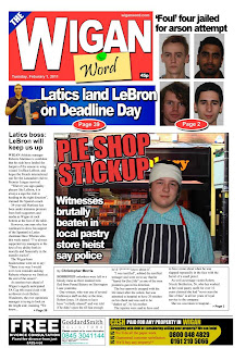
When designing and creating our real media texts we tried to incorporate visual signature marks that would link all three products together, the newspaper, poster and website. We did this mainly by including the Wigan Word logo on all three where it could be seen straightaway.

We also kept the same colour scheme throughout our products, using mainly red that distinguishes our products from others and adding some blue in their too. We used red because Wigan is highly associated with red, and sometimes even blue. However, these colours are occasionally common in existing newspapers as we found out in our research. Using this theme throughout the products allows them to be identified as products all linked together.


We tried to include the same fonts and structure throughout the newspaper and the two ancillary texts so when you looked at all of them you could tell they were the same product but displayed as different media types.

Tuesday, 28 February 2012

Poster Research

Before we begin our Poster we researched a couple of posters created by popular newspapers so we can get a few ideas on how to do ours.


This poster was used as part of The guardians world cup campaign , the main picture that the text is around is the corner of a football picture so the poster directly links to the world cup. When you first look at it the poster uses a varied amount of colours on a white picture so it catches the viewers’ attention.

The main message behind the Guardian newspaper poster is that they will be reporting about the World cup from every angle, it also goes on to list all the features that they offer in the newspaper. ‘Obsessive detail’ goes on to persuade the viewer that they will be covering the World Cup with maximum detail.


This poster was created for the Shropshire Star : RAF Cosford Air show. The use of a paper plane shows that it was in relation to the upcoming air show. They include a picture of the newspaper on the bottom to help people realise what the poster is for.

The use of the words 'up there' relates with the aeroplane which also tells the audience that is in relation to the air show. It also shows that the newspaper is competing with the big real media texts such as the sun and daily mail, as it its ‘up there’ in quality and quantity with the rest.


The posters above are from the sun and the guardian newspapers. They helped us realise that to get the newspaper noticed it has to be noticed, different to the rest and not merge with all the other advertisement surrounding it. A common trend in the posters above is that they have 1 main image, a minimal amount of text, Eye catching, includes a slogan, pronouns to involve the newspaper and they aren’t gender specific. We will keep in mind these generic conventions when designing our own poster.

Website: Finishing touches

With the website nearly completed we kept on reviewing the pages by using a very useful function that Dreamweaver offered. We had the ability to preview our designed website in a browser so we can use trial and error to make it better.

We noticed that the Page looked flat and boring. We wanted it to be more like the sun where it had a different colored background and a shadowed border around the page to make it seem off the screen. So altering the properties in the code and the dialog boxes provided we set the background colour to #E7E7E7 whih is a grayish colour. We also centered aligned the page since 100% of the websites we researched where following that trend.


We also managed to create a shadowed border by creating a white square the same width of the page in fireworks with a shadowed border, 1 pixel high. We then saved it as a picture and imported it onto our Dreamweaver document and repeated the picture down the Y-axis in the center so it gave the desired effects.

Below is two screen shots of using the function 'Preview in Browser' of our finished website.